Raw data in digital asset markets can feel like a tidal wave. It overwhelms traders, making it nearly impossible to spot trends or manage risks effectively. You know this struggle.
Without the right tools, you miss opportunities or make costly mistakes.
I’ve been there. I’ve watched traders flounder in confusion, drowning in numbers. My team has years of experience turning that chaos into clarity.
We’ve seen firsthand how effective visualization can lead to better decision-making.
This article is your important guide to understanding and leveraging crypto trading charts. We’ll break down how these visual tools can give you a competitive edge.
With practical takeaways from our experience, you’ll learn to interpret data confidently. You’ll walk away ready to tackle the complexities of digital asset trading. Let’s transform that overwhelming data into actionable takeaways together.
Decoding Digital Asset Trading Visualizations
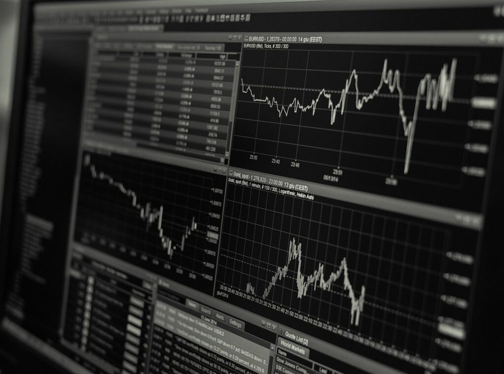
Ever stared at a crypto trading chart and wondered what on earth you’re looking at? You’re not alone. These visualizations are essentially graphical representations of market data for cryptocurrencies and other digital assets.
They simplify complex information, revealing hidden patterns that could be the key to making informed decisions fast.
What do these charts visualize? Mainly price movements, trading volume, market depth, and technical indicators. Think of it like turning raw data into a visual story.
Line charts, bar charts, and the classic candlestick chart each have their role. A line chart shows price movement over time. Bar charts give a snapshot of high, low, open, and close prices.
And candlestick charts? They combine all that, painting a fuller picture of market trends.
These visuals transform numbers into something you can digest at a glance. It’s like having a translator for market data. If you’re diving into Mastering Crypto Day Trading, understanding these charts is key.
They don’t just show numbers; they tell you when to hold or fold. So next time you’re analyzing a chart, remember (it’s) not just data. It’s your guide into the crypto market’s detailed dance.
Crypto Trading Charts: The Important Tool You Can’t Ignore
Let’s face it, the crypto world is a whirlwind of data. If you’re like me, you know the pain of information overload. That’s why crypto trading charts are a game-changer.
They slice through the chaos, turning a mess of numbers into a clear picture. Ever tried making sense of a spreadsheet full of figures? It’s like trying to read a novel in a foreign language.
Charts make it visual. You see patterns, trends, and signals like a seasoned pro spotting a hidden gem.
Bullish or bearish patterns jump out at you. It’s like being a detective with a magnifying glass. You’re not just guessing; you’re making informed decisions.
And let’s talk about risk. Identifying support and resistance levels? It’s not just smart.
But charts do more than that. They reveal market sentiment and trader psychology (yeah, traders can be predictable). This insight is useful.
It’s necessary. Charts offer this key insight. You’re better equipped to handle the wild swings of the market.
You understand what the crowd’s doing. It’s almost like having a peek into their collective mind. Want to see market momentum at a glance?
A volume chart tells you more in seconds than minutes spent on numerical data.
And here’s the kicker: they help keep emotions in check. You get objective takeaways, not just gut feelings. Check out platforms like cryptocurrencies to see these tools in action.
Trust me, in crypto trading, these charts aren’t just helpful; they’re indispensable.
Crypto Trading Charts: Decode and Conquer
Candlestick charts are fascinating, aren’t they? Each candlestick tells a story: the open, high, low, and close prices. A bullish candle means buyers are in control, while a bearish one signals sellers’ strength.
Patterns like the Doji or Hammer give us hints about potential market movements. But let’s not pretend we can predict the future with certainty. You see a Doji, and you think, “Ah, indecision.” But will it really swing the market?
Sometimes, yes. Sometimes, no.
Volume indicators add another layer. A spike in volume can confirm a trend. When volume decreases, it suggests the market’s taking a breather.
Or maybe everyone’s just decided to watch Netflix instead of trading. High volume often hints at a solid move ahead. But low volume?
That’s consolidation or maybe a sign of weakness.
Then there’s the order book. It reveals market depth. Those buy and sell orders waiting to be filled.
You can spot support and resistance levels here if you know what to look for. Ever notice how big orders can manipulate prices? It’s not always fair, but it’s reality.
Heatmaps are your quick visual on how different digital assets are performing. Colors show you what’s hot and what’s not. Strong performers light up one side while laggards hide in the dark.
You’ll see capital flow without overthinking.
Pro tip: Don’t just look. Study. These crypto trading charts are loaded with clues.
Interpret them wisely. Trading’s not just a science, it’s an art. And like all art, your interpretation matters.
Visualizing Crypto: Beyond Traditional Charts
Think traditional price charts are enough? Think again. On-chain data visualizations take crypto understanding to the next level. They show blockchain-specific metrics like transaction volume and whale movements.

These visuals help you follow whales analyzing trades for spotting market shifts early.
But that’s not all. Social sentiment analysis visuals are game-changers. They track public opinion, news sentiment, and social media buzz around digital assets.
Ever wondered why a coin’s price surged? Check the sentiment. It often leads price movements.
So, why not act on these cues?
Custom trading dashboards bring it all together. Imagine a screen where you see price, volume, on-chain data, and sentiment in one view. That’s a complete approach.
It’s not just about having crypto trading charts; it’s about integrating them into a full system. This gives you an analytical edge.
Pro tip: Start small. Use one or two data sources and expand. You don’t need everything at once.
Fine-tune as you learn. With these tools, you’re not just reacting; you’re predicting. Stay ahead in this crypto game.
Visuals aren’t just pretty. They’re solid.
Navigating Visualization Tools for Trading
Choosing the right visualization tool for your crypto trading charts can feel overwhelming. You want something user-friendly, not a nightmare to get through. Think about options like TradingView or CoinMarketCap.
They offer customization and important data. Start simple. Don’t go nuts with complex setups right away.
Add layers as you figure out what works best.
Try it. It’s like finding Easter eggs in a video game.
Pro tip: Experiment with combining different visualization types. You might uncover patterns others miss. Ever thought about how two seemingly unrelated charts might correlate?
Practice interpreting these visuals. It’s like learning a new language. The more you do it, the better you get.
Markets and tools change. You need to keep learning and adapting. That’s why it’s key to stay on top of new features and updates.
Your plan should evolve with what’s available. Complacency? It’s your worst enemy in this fast-paced world.
Embrace Your Advantage with Visual Tools
Your search for clarity in crypto trading charts ends here. Overwhelmed by data? Visualizations simplify complexity and boost your confidence in trading.
Start using these tools today. Integrate them into your plan and take your digital asset trading to the next level. Don’t wait; act now.